One of the most important step in photo printing is ensuring that what you see on the screen is what you will get on your prints. Given the cost of paper and ink, better make sure of that…
Now we already talked about the whole idea of a CMS (Color Management System) which should include all the steps of the photographic chain: scanner / camera, post-processing software, screen and printer. We know how to create a monitor ICC profile (even with a Spyder on Linux) and use this profile to make sure our color corrections are as “objective” as possible.
If screen calibration is important, printer calibration is crucial: it probably is the single step that gave me the most important boost in ease of use and satisfaction in post-processing.
Getting an ICC printer profile
Just like a monitor profile, a printer ICC profile tells how a printer prints the colors between the “theoretic pure red” and the “actual red that you get on paper”.
Now that tells us a first important thing: a printer ICC profile is valid for this printer, with this ink, this paper and these driver settings. It is a point to keep in mind since pigment base inks (today’s standard) allow you to work with several different papers – you need a new ICC profile for each paper type you use. Also, you see now why you don’t want to tweak the details of Gutenprint’s printing settings: this would make your profile invalid.
Creating a printer profile is very similar to a monitor one: you ask your printer to print theoretically known colors and you measure the difference between these values and the colors that are effectively printed on paper. The measuring device is called a spectrocolorimeter and the entry price PrintFixPRO from Colorvision (the same that do the Spyder) is available for just over $400 (on Amazone). Michael Reichmann wrote a hands-on review. It doesn’t work on Linux, though.
Now if you are a pro and use a gazillion different printers, ink types and papers combination, 400$ is a bargain (compared to what you spend in ink and paper anyway…). However, this may not be your case – I know it is not mine: I have one printer, one type of ink and since it is dye-based, I have to standardize on HP paper – and I only use glossy. So that’s one type of ink, one type of paper and one printer: I only need one ICC profile.
Fortunately, you can have someone create a profile for you. The process is fairly straightforward: download a JPG file with color patches, print it, send your print back (by post) and a few days later, you download your profile(s). A couple of precautions, though:
- use the same paper / ink combination that you want to use for your photographic work.
- make sure you leave your print to dry for 1-2 days before sending it back.
- use driver default settings – fire Cinepaint, convert the file to 16bits so you can print it and print with default settings. Don’t print from Windows if you want to use this profile in Linux!
- make sure you don’t change anything anymore 🙂
I used Christophe Metairie to have my ICC profile created – the site has all the instructions on how to proceed. You can also have profiles for B&W images (with variation between warmer and colder renditions) – I didn’t took the option since my printer supports B&W printing “natively”. And you pay about 50€ for your profiles – quality is supposedly better than what you would get with a Colorvision PrintFix SpectroColorimeter.
Other sites offering the same service would be: Image Science, InkJet Art or Coalson Editions (I have only used Christophe Metairie, though).
Gamut considerations
Now why printer calibration is so important is that a printer gamut is quite different and smaller that a screen gamut (or sRGB / AdobeRGB for that matter). Just to give you an idea, you will find below a couple of screenshots from a viewer (gtklookat) showing a VRML file comparing my printer and the AdobeRGB profiles – the VRML file is generated via ArgyllCMS utilities with the following commands:
iccgamut AdobeRGB1998.icc
iccgamut Printer.icc
iccgamut converts an icc profile to a .gam file – these files can then be combined to create the final VRML file:
viewgam -c n -t 0.0 -s Printer.gam -c n -t 0.0 -w AdobeRGB1998.gam final.wrl
-c n asks for natural rendition colors of the gamut shape, -t 0.0 asks for its full opacity, -s asks to print the shape of the profile while -w asks to print the profile as wireframe. So the AdobeRGB profile is in wireframe while the printer profile is “solid” – here is how it looks:
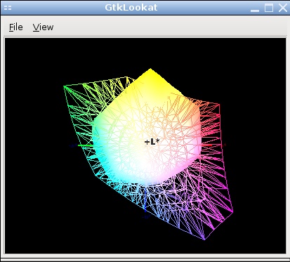
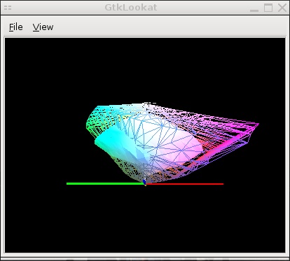
The printer can print some colors that aren’t part of the AdobeRGB gamut, while quite a few nuances that are part of the AdobeRGB gamut simply cannot be printed.
So it may happen that conversion between large gamut AdobeRGB and smaller gamut printer ICC profile gets tricky: you can have colors in your image that don’t “fit” by far in the printer gamut. In this case, there is always a loss and the question is how to minimize it. You may remember that there are 2 policies that can be used to convert an image from one to another profile: perceptual and relative. Which conversion policy you use can make a lot of difference in such cases.
Take this (very Geneva) image as an example. Here is an AdobeRGB version – well, the screenshot of Cinepaint displaying the colormanaged version of it (click on the images to get larger versions):

The problem is that the dark blue background is out of the printer gamut. So there will be losses when converting the image to the much smaller printer gamut. Here is a version which was converted to my printer profile using the perceptual conversion:

You can see an overall loss of saturation – the image looks a bit flat and less punchy. The strong contrast between the dark blue of the mountain and the white fountain isn’t as pronounced as before. However, all the nuances within the image are kept.
Here is the same image with a relative conversion:

This time, the overall saturation is better kept but the nuances are lost – you have ugly “flat” colors without nuances, especially when they would be most needed: in the areas where the fountain water is carried away by the wind.
Now in most cases, the conversion between large *RGB gamut and printer gamut is trivial. However, it can happen that you hit a difficult image and that tweaking is necessary (like in the case above). In this particular case, you probably want to start with the perceptual conversion (not too saturated) and see if it is possible to add a bit of saturation without deteriorating the nuances.
Remember that it is the direct comparison in front of your monitor that hurts your eyes – but when you display the printed version, the comparison is not there anymore. You can try leaving the converted image on your monitor for a bit – after a while, you will find it very pleasing… until you revert to the previous version.
However, the process can be hard to the point that I have a couple of pictures I consider “unprintable” due to the bad results of gamut conversion. It also happened to me once that I had to locally mask an image and modify local colors heavily to allow a smoother conversion to print gamut.
This however depends on your printer, the quality of your ICC profile (mine are the “older generation” from Christophe Metairie, the new ones should be better) as well as your CMS engine – the software that does the conversion.
Final word
Now this is all theory. Knowing what is going on behind the scene helps understand why we get good results or sometimes not so good ones – and the more we know, the better positioned we are to take corrective action in the second case.
In the next step we will see how to put all these concepts in practice and get gorgeous prints on Linux, using… guess what? Cinepaint. Let’s just say that once the in the background theory is understood, the practical steps are dead easy. Or so I hope.

Its important to note that when sending to your offset printing company, that you send it in CMYK… most digital photogrpahy software defaults to “RGB” which is fine for some digital presses and home printers, however if you want exellent results from your brochures and flyers, its best to send your images as CMYK (cyan, magenta, yellow & black). I know this post is about home printing, however its amazing how many people think the sames rules apply for press style priinting 😉
Correct me on that, but I think most digital press can do the separation in CMYK – and because the ink tints can vary slightly, it is even safer to leave that job to your digital press.
I am not at the point where my photographs need high quantity poster-size printing anyway…
Thanks for sharing this. Ensuring the right color for printing is essential to produce the right quality of pictures.
Бесплатная эффективная реклама
Лучшая БЕСПЛАТНАЯ реклама товаров, услуг и бизнеса со ССЫЛКАМИ на сайты, картинками и видео. ТИЦ ресурса 90, находится в Яндекс каталоге! http://rekforum.forum2x2.ru
F*ckin’ remarkable issues here. I’m very glad to peer your article. Thanks a lot and i am looking forward to touch you. Will you please drop me a mail?
Very soon this website will be famous amid all blogging viewers, due to it’s good articles or reviews